ShopDreamUp AI ArtDreamUp

Deviation Actions


Description
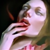
Inspired by the tales of ghosts, queens, and bloody drinks.
I'm enrolling in an AP art class and one of the prompts was to draw the same face from three or more perspectives. The teacher suggested to use geometric shapes in the background to contrast the organic features of the face, and this is my interpretation of the assignment. I think I developed it more than the assignment wanted or I intended to....")
I hope you enjoy!
I'm enrolling in an AP art class and one of the prompts was to draw the same face from three or more perspectives. The teacher suggested to use geometric shapes in the background to contrast the organic features of the face, and this is my interpretation of the assignment. I think I developed it more than the assignment wanted or I intended to....
I hope you enjoy!
Image size
2600x3467px 4.07 MB
© 2011 - 2024 Lichida
Comments12
Join the community to add your comment. Already a deviant? Log In
I keep coming back to this to give it that critique that you won during the summer for but it's so hard to even find nit-picky things. (That and you turned the critique mode off XD)
For now I suppose if you wanted to improve the picture in little ways a good place to start would be to go in and detail by adding pores onto the skin just to make it more realistic. The skin does have texture in some places but not others so super detailed pores would just make a person stop and go 'Wow... @.@'
All the different perspectives look really good but to me the bottom downward facing one looks a little off to me. I think it's because there's such a sharp shine on the nose and such a shadow on the bridge of the nose. This almost makes it look like the face is being sucked in a little there but it's not that noticeable.
I flipped the picture over and it showed that the picture leans a little heavier to the right than the left. The right face is a little bigger and more pronounced than the left one but that isn't noticeable unless you're weird like me and flip it over.
Personally I adore your choices of color. I love how the hair isn't detailed strand for strand so it stands out nicely against the bold red colors. It really adds a nice contrast to the overall picture. I really like the purples at the bottom and the hints of green. It really shows a good mastery of color choice and contrasting.
Basically it's more amazing than anything I'll be able to create for awhile, the color is amazing, the composition is amazing and I only found nit-picky things in the name of a slightly lengthy critique. It's an amazing piece and it's one of my favorites from you.